Get Ads Box with cool CSS effect as used in Spice Up Your Blog

Click to enlarge the image (on the image)
Hi guys as every one knows these days the Spice Up Your Blog ads widget for the blogs are very hot to be seen and look well equipped ad box with some cool rates going high well with this post you can also get the same kind of ad widget as shown in the image beside even at your blog. This widget has got cool CSS effect  so that it makes all the advertisers think that this blog is well designed and developed and get cool advertisers.

To do this just follow the steps given below:

Animated Bubble Buttons Using CSS3 On Blogger

bubble-buttons
I'm sure my last tutorial about "Text with Moving Backgrounds" was quite complex. It would have been very difficult for the newbies to get hold of. So, I thought I should come up with a simple, yet stunning design tutorial that even the newbies can enjoy about. Well, that idea drove to me to present you this tutorial about "Animated Bubble Buttons Using CSS3". Take a look at the demo below.


Hit any of the buttons above to check the other styles as well. I think, I need not explain more about the effect that you'll be able to achieve on completing this tutorial. It's pretty clear from the demo button / link above. I wish to let you know that these effects are visible only on browsers that support CSS3. However, we've incorporated a fall back color with the bubble effect for browsers that do not support CSS3 thereby, preventing your design from causing various layout issues.

Enough of stories I guess! So, let me start with the tutorial. I'll split the tutorial into 2 parts - HTML and CSS. The HTML involved behind these buttons are very simple. You need to add a corresponding class (based on the size and the color of button) to the anchor tag. Just use the following tags anywhere in your template - anywhere between your body tags.

HTML FOR LARGE SIZED BUTTONS (USE ANYONE BASED ON COLOR)
<a class="button big blue" href="LINK">LINKNAME</a>
<a class="button big green" href="LINK">LINKNAME</a>
<a class="button big orange" href="LINK">LINKNAME</a>
<a class="button big gray" href="LINK">LINKNAME</a>
HTML FOR MEDIUM SIZED BUTTONS (USE ANYONE BASED ON COLOR)
<a class="button blue medium" href="LINK">LINKNAME</a>
<a class="button green medium" href="LINK">LINKNAME</a>
<a class="button orange medium" href="LINK">LINKNAME</a>
<a class="button gray medium" href="LINK">LINKNAME</a>
HTML FOR SMALL SIZED BUTTONS (USE ANYONE BASED ON COLOR)
<a class="button small blue" href="LINK">LINKNAME</a>
<a class="button small green" href="LINK">LINKNAME</a>
<a class="button small orange" href="LINK">LINKNAME</a>
<a class="button small gray" href="LINK">LINKNAME</a>
Note: Replace LINK with the link you wish to point to. Similarly, LINKNAME with the name/title of your link.

The CSS involved behind these buttons are pretty complex. I don't want to explain in detail about the same and confuse you - especially, if you are a newbie. So, just download this file -  CSS FOR ANIMATED BUBBLE BUTTONS, and paste the code present in it just above/before skin in your blogger template and save your template. That's it!

Well, if your a CSS geek, then you may tweak the CSS mentioned in the text doc above to add further effects. The content mentioned in the text document involves the CSS for all types of buttons - be it any size or color. If you are one, who is obsessed with reducing the load time of your site (like me), then define the CSS only for those buttons you intend to use. For further assistance or suggestions about this article, leave a comment below.
Design Inspiration - Tutorialzine.

Cool Image Hover Effect On Blogger - Popout Details

popout-details-blogger
I recently came across a cool image hover effect on a WordPress blog which made me to work out the codes for achieving a similar effect on blogger. The idea behind this effect is to display a short snippet/detail about the image on hover using only CSS. Many had already seen the demo on my test blog while those who did not, just take a look at the live demo by visiting the link below.

POPOUT DETAILS EFFECT ON BLOGGER - LIVE DEMO

Cool... Isn't it? Just follow the instructions given below to get a similar effect on your blog as well. Just create a back up in case something goes wrong. To do so, navigate to "Design>>Edit HTML" and click on the "Download full template" link at the top of the page. That's it!

1. Once the back up is over, paste the following piece of code anywhere between the 'body' tags on your template - probably below <div id='content-wrapper'> (or) <div class='columns fauxcolumns'>.
<ul class="columns">
 <li>
  <a href="#"><img src="IMAGE URL" /></a>
    <div class="info">
      <h2>TITLE</h2>
      <p>DESCRIPTION</p>
    </div>
 </li>
</ul>
2. Replace '#' with the link you wish to point to and 'IMAGE URL' with the URL of your image, probably with the following dimensions - 220x200px. Similarly, replace 'TITLE' and "DESCRIPTION' with the title and description you wish to have on hover, respectively. Repeat the codes within 'ul' tags for adding multiple images.
You may download the reference code, which I used on the demo site, here - Reference.
3. Let's style the above HTML with some CSS. To do so, search for the following code on your template.
]]></b:skin>
4. Paste the following piece of code just above the line mentioned in step 3.
ul.columns {
width: 480px;
list-style: none;
padding:0px;
margin-left:10px;
}
ul.columns li {
width: 220px;
float: left; display: inline;
margin-top:15px;
margin-left:7px;
margin-right:7px;
margin-bottom:7px; padding: 0;
position: relative;
}
ul.columns li:hover {z-index: 99;}
ul.columns li img {
position: relative;
filter: alpha(opacity=30);
opacity: 0.3;
-ms-filter:"progid:DXImageTransform.Microsoft.Alpha(Opacity=30)";
}
ul.columns li:hover img{
z-index: 999;
filter: alpha(opacity=100);
opacity: 1;
-ms-filter: "progid:DXImageTransform.Microsoft.Alpha(Opacity=100)";
}
ul.columns li .info {
position: absolute;
left: -10px; top: -10px;
padding: 210px 10px 20px;
width: 220px;
display: none;
background: #fff;
font-size: 1.2em;
-webkit-border-radius: 3px;
-moz-border-radius: 3px;
border-radius: 3px;
font-family:Georgia,"Times New Roman",Times,serif;
text-align:justify;
}
ul.columns li:hover .info {display: block;}
ul.columns li h2 {
font-size: 1.2em;
font-weight: normal;
text-transform: uppercase;
margin: 0; padding: 10px 0;
font-family:Georgia,"Times New Roman",Times,serif;
}
ul.columns li p {padding: 0; margin: 0; font-size: 0.9em;}
5. You need not modify anything the codes above except for the margin positions to best fit your blog. That's it! Save your template and take a look at the cool effect on your blog.

The above effect worked successfully on the major browsers which includes, but not limited to, IE, Firefox, Chrome, Opera and Safari. So, give them a shot on your blog and let us know whether you enjoyed this cool effect via comments! See you soon with another interesting tutorial. You may check out the other image hover effect here - Shadow Effect.
Inspiration for the above article - Sohtanaka.

Photo Stack Effect Using Only CSS3

photo-stack-effect-blogger
There's a lot of buzz around the web about Google plus! I'm sure many, including me, are fascinated about circles! Well, did you find time to check out the other sections - albums on Google+? If not, try it now! You'll find a cool transition effect on hovering your mouse over the albums! Inspired by this, I googled about the same & found a solution to get it work on Blogger. Take a look at the demo here.

PHOTO STACK EFFECT - LIVE DEMO (LOOK AT THE SIDEBAR ON DEMO BLOG)

The main advantage with the above hack is that it works purely with CSS3. No Javascript nor Jquery - only CSS! However, there is one main disadvantage working with pure CSS3 - browser compatibility issues! The above hack works only on browsers that support CSS3! I'll try to get the same effect working on all browsers, with a gradual transition rather than the abrupt change, using Jquery in the upcoming weeks! Anyway, let's get started with this tutorial now...

1. Navigate to "Design>>Edit HTML" and make a backup of your template by clicking on the "Download full template" link at the top of the page. Once the back up is over, search for the following piece of code.
]]></b:skin>
2. Download the following text document - CSS FOR PHOTO STACK EFFECT and paste the code present in it just above the line mentioned step 1. 
3. Save your template. To realize the stack effect, declare image tags with class="photo1", class="photo2" and class="image3" respectively. Then, wrap them with an anchor tag using class="album". That's it! Difficult to understand?  Then, paste the following code anywhere on your template to realize the final effect.
<a class='album' href='#'>
<img class='photo1' src='IMAGE URL'/>
<img class='photo2' src='IMAGE URL'/>
<img class='photo3' src='IMAGE URL'/>
</a>
Note: Replace IMAGE URL highlighted in blue with your image URLs to realize the stack effect on your blog. If you wish to extend the same effect for more than 3 photos, then ping me via gtalk or leave a comment, I'll help out to achieve the same!
4. Save your template and view the same on a browser that supports CSS3 - possibly using FF3+!

Over the past few weeks, I've been trying to post articles that are pretty unique on blogger. I would like to receive your opinion about the same. I hope you enjoy the articles on my blog including the one above! Please share your views about the same via comments:) Check out the other interesting tutorials on CSS here - CSS Tricks

Adaptable View On Blogger - Introduction

Apaptable-view-on-blogger
It sounds pretty interesting rather strange to hear adaptable view. Isn't it? Well, adaptable view is basically an user interface pattern that allows people to change the visual appearance of the content/design on your blog. This offers more flexibility and control to the user over your content/design. A very good example to illustrate this effect could be on your delicious bookmarks.

Just navigate to the following link - Recent Bookmarks. Notice the three tabs/links that say "Low | Medium | High" once you hit the display options. Each one shall show you a different view: single, compact or full. So, how do I achieve a similar effect on blogger? Pretty simple, provided you have some knowledge about CSS and Jquery! Adaptable view can be used to change background colors, switch layouts, increase or decrease font size, darken or lighten the post area - as you see on Sohantaka's blog when you toggle the article view, etc...

In this article, I'll illustrate the above effect using two views: single-column and two-column view. Users can switch their views between single-column and two-column dynamically. I don't want to take too much of your time on explaining the same further. So, take a look at the live demo and let's get started...

ILLUSTRATING BASICS ABOUT ADAPTABLE VIEW ON BLOGGER - LIVE DEMO

1. Navigate to "Design>>Edit HTML" and make a backup of your template by clicking on the "Download full template" link at the top of the page. Once the back up is over, search for the following piece of code.
]]></b:skin>
2. Paste the following piece of code just above the line mentioned step 1.
#commands { margin-top:50px;}
#list { width:580px; margin:0px; padding:0px;}
#list li { list-style:none; display:block; width:560px; background-color:#D7D3E0; padding:5px; margin:5px;}
#list li span { font-size:1.2em; margin-right:10px; font-weight:bold;}
#list.compact li { float:left; width:270px;}
3. Next, search for the following piece of code.
</head>
4. Paste the following piece of code just above the line mentioned in step 3. Save your template.
<script src='http://ajax.googleapis.com/ajax/libs/jquery/1.6.2/jquery.min.js' type='text/javascript'/>
<script type='text/javascript'>
$(document).ready(function() {
$("#fullswitch").click(function() {
$("#list").removeClass("compact");
});
$("#compactswitch").click(function() {
$("#list").addClass("compact");
});
});
</script>
Note: You need not paste the first line (highlighted in orange) in the above coding if you already have the jquery file running on your blog.
5. Now, insert the following tags anywhere in your template - may be within the post editor or on  the sidebar or below the content wrapper. Replace CONTENT HERE with your content.
<div id="commands">
Click on icons to change view:
<a href="#commands" id="fullswitch">
<img src="https://lh3.googleusercontent.com/-2y4pzJuYcjs/TjJ5jYMHtTI/AAAAAAAABac/YRmIswHipxE/s800/switch_full.png"/>
</a>
<a href="#commands" id="compactswitch">
<img src="https://lh3.googleusercontent.com/-WKPq4xPCASU/TjJ5jIrsdMI/AAAAAAAABaY/juaHG4yFUj8/s800/switch_compact.png"/>
</a>
</div>
<ul id="list">
<li> CONTENT HERE </li>
</ul>
6. That's it! Save your template just in case you made use of the code on your template else, publish the post  with the codes mentioned in step 5 and you're done!

I would like to provide the reference script (used within the post editor to illustrate adaptable view on  the demo blog) for those who find it difficult to work out step 5 in the above tutorial. Download the reference script here - REFERENCE.

The above effect was tested to work fine on all major browsers - IE, Firefox, Opera, Safari. I'll illustrate the same (adaptable view) with more examples in the upcoming articles on my blog. Subscribe to my blog so that you don't miss any article that might interest you like the one above:) Share your opinions via comments! You may read more about the tutorials on jquery here - Jquery.

Subscription Box Using Tooltip For Blogger

tooltip-tutorial
In my previous article about HTML Tooltip, I mentioned about "callingallgeeks.org". If you missed the article, then check out - Tooltip For Blogger Using jQuery & CSS. Harsh on his blog "callingallgeeks.org" used this effect to display the Tooltip over the share icons - RSS, Twitter, Facebook. You may experience the Tooltip effect on Yahoo! Cricket too - hover your mouse over the player names.
Subscribe-Tooltip-Demo
In this article, I'll just share the code which will create the Tooltip effect when you hover your mouse over the subscribe icons. If you need the code for the entire subscription box, well install the widget that appears on this article first - Tutorial to add the subscription box. Later, use the code that appears in this post to realize a proper subscription box. So, let's get started.

1. Navigate to "Design >> Edit HTML" and make a backup of your template by clicking on the "Download full template" link at the top of the page. Once the back up is over, search for the following piece of code.
]]></b:skin>
2. Paste the following piece of code just above the line mentioned in step 1.
#dhtmltooltip {
background-color: #484848;
background-image: url("https://lh4.googleusercontent.com/-5SQOgS6ij1A/TiE0rmXU9gI/AAAAAAAABUQ/KwaaLmoeP4c/s800/mouse-hover-bg.png");
background-repeat: repeat-x;
border: 1px solid #AAAAAA;
color: #F2F2F2;
font-size: 12px;
font-weight: bold;
height: 27px;
line-height: 20px;
padding: 10px 20px;
position: absolute;
text-align: center;
z-index: 100;
visibility:hidden;
}
#dhtmlpointer{
position: absolute;
z-index: 101;
visibility:hidden;
}
.social-subscribe ul {
list-style: none outside none;
}
.social-subscribe li {
float: left;
}
.social-subscribe li a.rss {
background: url("https://lh3.googleusercontent.com/-HTQ6s6GmBLg/TiE0rFVVQsI/AAAAAAAABUI/pWdIwOUEuA8/s800/icon-rss.gif") no-repeat scroll 0 0 transparent;
padding: 0 2px 0 0;
}
.social-subscribe li a {
display: inline-block;
height: 52px;
width: 57px;
}
.social-subscribe li a.facebook {
background: url("https://lh6.googleusercontent.com/-tkdaWLGbFQI/TiE0rPLM1QI/AAAAAAAABUE/DG4wcOs1xwY/s800/icon-facebook.gif") no-repeat scroll 0 0 transparent;
padding: 0 2px 0 0;
}
.social-subscribe li a {
display: inline-block;
height: 52px;
width: 57px;
}
.social-subscribe li a.twitter {
background: url("https://lh4.googleusercontent.com/-bIK53VccMss/TiE0ra0pGKI/AAAAAAAABUM/NewFfwHhH7U/s800/icon-twitter.gif") no-repeat scroll 0 0 transparent;
padding: 0 2px 0 0;
}
.social-subscribe li a {
display: inline-block;
height: 52px;
width: 57px;
}
3. Save your template and navigate to "Design >> Page Elements >> Add a Gadget" and choose "HTML/Javascript".
4. Download the following text document - HTML FOR TOOLTIP EFFECT ON SUBSCRIBE ICONS. Just copy the code present in the text document and paste it on the window that pops up. Make the following customizations before you save the widget.
  1. Replace FEEDNAME with the name of your feed obtained from FeedBuner. Your feed name is nothing but your feed title. So, open your FeedBurner account and check out the Feed details. There are two instances where you need to replace FEEDNAME with your feed name.
  2. Replace TWITTER-USERNAME with your twitter user name. There are two instances where you need to replace the same.
  3. Replace FAN-PAGE-URL with your facebook fan page URL. Similar to the previous two customizations, this replacement should also be made at two instances.
5. Once the above customizations are made, just save the widget and your done!

In case you find the customization part a bit difficult to understand, then take a look at the example coding which I used on my demo blog by downloading this text document - SAMPLE CODE. This effect was tested on all major browsers - Firefox, IE, Safari, Chrome, Opera. If you have some unique ideas to illustrate this same effect in a different manner, then share it via comments! Would love to hear from the CSS and Jquery geeks out there!

Cross-Browser Gradient Effect Using CSS

cross-browser-css-gradient
Many themes, be it blogger or WP, make use of gradient effects. About 95% of them, use an image to achieve the gradient effect. However, the same can be realized with CSS. In this tutorial, we'll let you know how to achieve this gradient effect on all major browsers - IE, Firefox 3.6+, Safari, Chrome and Opera. So, let's get started...

If you are a WordPress user, then you need to add the following CSS mentioned in the tutorial to your ".css file" and upload the same to your server. If you are blogspot user, then you need to add the following CSS codes just above the following code in your template - ]]></b:skin>

FOR WEBKIT BROWSERS
To realize the gradient effect on webkit browsers like Safari, Chrome, etc... just include the following line in the CSS part of your theme.
background: -webkit-gradient(linear, left top, left bottom, from(#ccc), to(#000));
FOR FIREFOX 3.6+
To visualize the gradient effect on Firefox, add the following piece of code in the CSS part of your template.
background: -moz-linear-gradient(top, #ccc, #000);
FOR INTERNET EXPLORER
Use the following code to enable the gradient effect on IE.
filter: progid:DXImageTransform.Microsoft.gradient(startColorstr='#cccccc', endColorstr='#000000');
Note: You may change the color codes highlighted in green and blue as per your choice. The codes which are highlighted in green represent the starting color in the gradient effect while the code highlighted in blue represents the ending color. I suggest you to take a look at the following link to easily pick the color code of your choice - HTML Color Codes Generator.

To see the effect on all the browsers, simply combine the above mentioned codes. So, you'll have a browser compatible CSS gradient effect. However, I strongly suggest you to provide a simple color as a background in case the user is using a browser that does not support CSS3. Hence, your final code should be similar to the one shown below.
background: #ccc; /* for non-css3 browsers */
filter: progid:DXImageTransform.Microsoft.gradient(startColorstr='#cccccc', endColorstr='#000000'); /* for IE */
background: -webkit-gradient(linear, left top, left bottom, from(#ccc), to(#000)); /* for webkit browsers */
background: -moz-linear-gradient(top, #ccc, #000); /* for firefox 3.6+ */
If you feel the above the post is too complex to understand, then I suggest you to visit this link -  Ultimate CSS Gradient Generator and choose the gradient effect of your choice for different colors. Once you make a choice at the left, you can preview the same at the right. Moreover, the required CSS to be inserted in your theme will also be generated. So, just copy that & insert it in your template. That's it!

Why gradient effect using CSS? Simple! No external HTTP requests - increases the loading speed of your web page on all browsers... I recommend you to read the following articles to know more about page speed of your blog - Speed Up Your Blog - Tips And Tools, How To Speed Up Your Blogger Blog? and Using CSS Sprites On Blogger - Introduction. Share your opinions about the article via comments!

Tooltip For Blogger Using jQuery & CSS

tooltip-for-blogger
Recently, I came across an interesting tutorial about displaying Tooltip using jQuery. You may refer to "callingallgeeks.org - subscription box" to see an example about the same. In this article, we'll be learning about adding a simple HTML Tooltip to our blogger posts/template. You may check out the live demo by hovering your mouse over the links below.


Cool trick. Isn't it? Well, if your answer to the question is "Yes", then consider reading the rest of the article to get this hack installed on your blog as well. I have used the standard jQuery file that's hosted by Google in my tutorial. If you wish to host it on your blog ( for WordPress Users), then download the latest JavaScript file from jQuery website. Now, let's move to the tutorial.

1. Navigate to "Design >> Edit HTML" and make a backup of your template by clicking on the "Download full template" link at the top of the page. Once the back up is over, search for the following piece of code.
]]></b:skin>
2. Download the following text document (includes the CSS and JavaScript to run the widget) - CODE FOR TOOLTIP WIDGET. Replace the above code with the code present in the text document.
3. Save your template. That's it. 

To make the Tooltip actually work, you need to define an anchor tag and span tag in your post or anywhere in your template (within the body tags) with the following classes ( tip_trigger and tip) present in it. The coding should look similar to the one shown below.
<a href="YOUR LINK HERE" class="tip_trigger">
YOUR LINK TITLE
<span class="tip">
YOUR TEXT HERE
</span></a>
That's it! Replace "YOUR LINK TITLE" with the title of your link, "YOUR LINK HERE" with the URL you wish to point to and "YOUR TEXT  HERE" with the description you want to show the visitor on mouse hover. You need to repeat the same procedure to have multiple Tooltips on your blog. As far as the browser compatibility is concerned, the Tooltip hack is supported by the following major web browsers - Firefox, IE, Safari, Chrome, Opera, etc...

I hope you enjoyed this hack. Well, I'm just learning the basics about jQuery and CSS now. So, if there are any jQuery geeks out there, then I'm open to your suggestions. Share your opinions via comments. I'll soon post the coding for the subscription box using Tooltip similar to the one on "callingallgeeks".

Add Fancy Share Icons To Every Blogger Post

share-icons-blogger
I'm sure everyone runs a social bookmarking widget on their blog. What if we add a little more interactivity & unique style to those icons. This is exactly what we're gonna do in this article! We plan to turn an unordered list of sharing icons into a fancy share box using little CSS & Jquery. The idea is to show the icons partially hidden. When hovered, they slide to the right & become completely visible.

FANCY SHARE ICONS USING CSS & JQUERY - LIVE DEMO

Well, I guess that the demo has impressed you. Before I proceed with the tutorial, I would like to inform you that this particular widget is browser compatible - works on all major browsers. The code was tested on the following major browsers - Firefox 3+, IE 6+, Safari, Chrome & Opera). Enough of the stories! Let's get this installed on our blog.
fancy-share-box-blogger
1. Navigate to "Design>>Edit HTML" and make a backup of your template by clicking on the "Download full template" link at the top of the page. Once the back up is over, expand your template and search for the following piece of code.
<div class='post-footer-line post-footer-line-1'/>
2. Download the following text document - FANCY SHARE ICONS FOR BLOGGER. Paste the code mentioned in the text document just below the line mentioned at step 1.
3. Next, search for the following piece of code.
]]></b:skin>
4. Replace the above code with  following piece of code.
ul.sharebox { margin:0px; padding:0px; list-style:none; position:relative;}
ul.sharebox li { float:left; margin:0 0 0 0px; padding:0px; position:absolute; }
ul.sharebox li a { margin:0 0 0 -24px; display:block; }
ul.sharebox li a:hover { margin:0 0 0 -8px; }
ul.sharebox li img { border:none;}
]]></b:skin>
<script>
$(document).ready(function(){
var i = 10;
var j = 0;
$("ul#sharebox li").each(function() {
$(this).css("z-index", i)
if (j > 0)
$(this).css("left", j * 24 + 100 + "px");
i = i - 1;
j = j + 1;
});
});
</script>
7. That's it. Save your template.

Note: The effect is visible only on the post page, in other words, you need to visit the individual pages on your blog to realize the effect. If you want them to appear on all the pages, then just remove the first and the last line of the coding mentioned at step 2.

I hope you enjoyed this widget. If you wish to add a specific icon apart from the list mentioned in the article, please contact me via email with the icon and your template. We'll try to add them for you provided your template has already got this widget installed! Share your views via comments!

Word-Wrap : An Extremely Useful CSS Property

CSS-LogoI'm pretty addicted to web design and photo-shop these days. So, you might encounter a lot of articles related to web design & CSS in the upcoming weeks. Well, just because I post a lot about these stuffs, it does not mean that they are not useful being a blogger. All those tutorials and tricks that I post here will have some relation to your blog. And one such extremely useful but rarely used CSS property is "Word-Wrap"

What does Word-Wrap actually do? To keep it simple, it actually wraps the word or in other words, breaks the word to a new line without exceeding the specified boundaries. For example, when you  look at coding part in some of my tutorials, they would extend beyond the specified boundary(grey box). Have a look at the following picture and you'll understand what I mean!
word-wrap-property
I hope you understood the importance of this extremely useful CSS property - "Word-Wrap".  To illustrate this, I recommend you to read this article - How to add HTML codes in Blogger Posts? So, you got to know "How to include HTML codes in your post?". Generally, this problem of text extending beyond the specified boundary occurs with IE. To make your posts with HTML codes compatible with all browsers(IE 5.5+, Firefox, Safari, Chrome), just follow these steps assuming that you installed the coding as mentioned in the reference article above.

1. Navigate to "Design >> Edit HTML" from your blogger dashboard and search for the following  piece of CSS code in your template.
.codeview {
2. Just add following piece of code below the line mentioned in step 1.
word-wrap: break-word;
3. That's it!!! Save your template.

For users who blog on WP or any other platform, just specify the following tag in the CSS part of your template. It's not necessary that you use it only for displaying the coding stuff - use it anywhere you want the word to wrap by itself within the specified boundaries.
word-wrap: break-word;
To extend them beyond the boundaries (definitely not the idea behind this post), either remove the tag specified above or change the parameter from break-word; to normal;

I hope this simple tip enhances the design of your blog - to keep it neat and clean. This CSS property comes in handy especially for webmasters and web designers. So, share your views about this post. Your comments are always welcome!

Unique Navigation Bars Using CSS Sprites

Navbar-Tutorial
In my previous article about CSS Sprites - Introduction, I told you about the hover effect with an example. We did mention that we would come up with more practical examples so that you realize the importance of CSS Sprites. So, we have come up with step by step instructions (including a little bit of PhotoShop tutorials) for creating a unique navigation bar based on CSS Sprites.

PHOTOSHOP TUTORIAL
To create a navigation bar that stands unique from the rest of the other blogger templates, it becomes a little mandatory that you know a little about PhotoShop. So, we will just let you know how to create one.

1. Open Adobe PhotoShop. Create a new transparent file with the dimensions you want. Most of the blogs usually have a navigation bar of width 960px and height varies between 30-50px. In this tutorial, we will be working with an example of dimension 495 x 48px.
Sprites-Navbar-Tut-1
2. Now, let your imagination run wild. Create a unique navigation bar as per your wish. Try different fonts, change pixel sizes, change the text color (or) include images next to each text. It's your navigation bar. So, have it your way. The design which I made is a simple one with icons next to each text as shown below.
Navbar-01
3. Save this image as "Nav-01" using "File>>Save for Web..." option to obtain a .png image. This image will serve as the base image below which we will build another image for the hover effect. So, create another new file with same width as that of the initial image but double the height. In my example, I had an initial image with dimensions 495 x 48 px. The new image should be 495 x 96 px.
Sprites-Navbar-Tut-2
4. Now, open "Nav-01.png" and copy the entire image to the new file which you created. Place the image to fit the window dimensions. You will find a new layer being created that has a label "Layer 1". Have a look at the following picture for better understanding.
Sprites-Navbar-Tut-3
5. Now, duplicate that layer (Layer 1) as shown below.
Sprites-Navbar-Tut-4
6. We need to show a difference when the mouse is hovered over the link. For this very reason, place the duplicate layer below the first layer and work on the duplicate layer alone. You may show difference by changing the text color (or) have gradient effects...
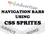
7. In my case, I have just added a small box to appear above each link. So, the final outcome would be something like the one shown below.
Final-Navigation-Bar
Well, save this image as "Final-Nav-Bar.png" and upload the same to PICASA or ImageShack or any image up-loader. Obtain the URL and save it to a temporary text file!!!

"I'm sure you would have gone nuts before you got the exact look you had in your mind! Assuming that you got one, you may have a cup of coffee to relax yourself before we move the next part in the tutorial."

HTML PART
The HTML coding involved with the navigation bar is pretty simple. We make use of an unordered list with 4 list items present it. We make use of span tags in the HTML part so that, the search engines index the text along with the image rather than only the image. Well, you may extend the list to any number as you want. Make sure the text on the image and text in between the span tag matches else you will end up flagged. You may place the following piece of code anywhere in between body tags to realize the effect.
<ul id='nav-example'>
<li id='nav-example-1'>
<a href='#'><span>Home</span></a></li>
<li id='nav-example-2'>
<a href='#'><span>Advertise</span></a></li>
<li id='nav-example-3'>
<a href='#'><span>Contact</span></a></li>
<li id='nav-example-4'>
<a href='#'><span>Portfolio</span></a></li>
</ul>
Save your template once you add the above code! You may replace the '#' symbol with the links you wish to point to. It's pretty self-explanatory!

CSS PART
The CSS part will vary from person to person depending upon the image size you chose and other specifications. However, the basic layout will remain the same. You just need to vary few parameters in the coding below to match your creative work.
#nav-example {
background:url("https://lh4.googleusercontent.com/-xbhbCcnBhYI/Tft-OgZOwTI/AAAAAAAABII/lh1EAkmm0ps/s800/final-nav-bar.png") no-repeat;
width:495px;
height:48px;
margin:0;
padding:0;
}
#nav-example span {
display: none;
}
#nav-example li, #nav-example a {
height:48px;
display:block;
}
#nav-example li {
float:left;
list-style:none;
display:inline;
}
#nav-example-1 {width: 125px;}
#nav-example-2 {width: 122px;}
#nav-example-3 {width: 122px;}
#nav-example-4 {width: 123px;}
#nav-example-1 a:hover {background:url("https://lh4.googleusercontent.com/-xbhbCcnBhYI/Tft-OgZOwTI/AAAAAAAABII/lh1EAkmm0ps/s800/final-nav-bar.png") 0px -48px no-repeat; }
#nav-example-2 a:hover {background:url("https://lh4.googleusercontent.com/-xbhbCcnBhYI/Tft-OgZOwTI/AAAAAAAABII/lh1EAkmm0ps/s800/final-nav-bar.png") -125px -48px no-repeat; }
#nav-example-3 a:hover {background:url("https://lh4.googleusercontent.com/-xbhbCcnBhYI/Tft-OgZOwTI/AAAAAAAABII/lh1EAkmm0ps/s800/final-nav-bar.png") -247px -48px no-repeat; }
#nav-example-4 a:hover {background:url("https://lh4.googleusercontent.com/-xbhbCcnBhYI/Tft-OgZOwTI/AAAAAAAABII/lh1EAkmm0ps/s800/final-nav-bar.png") -369px -48px no-repeat; }
If you are blogger - blogspot user, then place the above code just before the following line. Use "CTRL+F" to search your blogger template.
]]></b:skin>
Finally, replace the link which points to my example to your image URL - the one which you temporarily saved on a text document. Just replace the code highlighted in blue with your link. Save your template!

CUSTOMIZATION
1). The very basic step in customizing the CSS part to match your navigation bar would be to change the width and the height of the bar. As mentioned earlier in the post, I worked on 495 x 48 px version while your navigation bar could be much larger or smaller. So, vary the code that is highlighted in green to match the dimensions of your navigation bar and save them.

2). Note the codes highlighted in orange. These codes specify the width of the lists in the navigation bar. In my example, the first list occupies a width of 125px while the second one occupies a width of 122px and so on... You may vary this as per your design. It's better to use the option of "Rulers" in PhotoShop to know the exact width of each item. Make the respective changes as per your design and save them!

3). The background position for the a:hover state is pretty easy to fix. The vertical position will never vary because you have to display the complete bar. So, you can simply mention the height with a negative sign prefixed to it. To find the horizontal position ( Highlighted with Rose Color), initially you start off from 0px. The next position shall be obtained by subtracting from the nav-example-01 state, that is, 0 - 125 = -125 px. Similarly for the next position, obtain it from nav-example-02, -125 - 122 = -247px. This shall be done for your entire list. That's it! Save the template and your done!

Your final output should be as shown in the following DEMO LINK - NAVIGATION BAR USING CSS SPRITES, provided you followed all the steps correctly! Just hover your mouse over the lists on the page and enjoy the effect!!! Another great example to let you know how creative your work could be - CSS Navigation Bar Example.

"If you wish to have unique navigation bars for your blog without any hassle, then reach us via Our Services page. We'll design distinct navigation bars for you and set them on your blog too!!! Why to break your head when we are there to do that:)"

I tried to keep things as simple as possible! If you find any difficulties, our comments section is always welcome. Leave a comment and clear your doubts. We'll see you in another interesting tutorial!

Using CSS Sprites On Blogger - Introduction

CSS-Sprites
I'm sure many of you would have visited websites like Yahoo!, YouTube, Facebook, etc.. Have you ever wondered how quick these websites load though they possess a lot of images in the background? How is it possible? Is it possible only for websites - not for blogs on blogger? Definitely not, we can have these effects on blogger too. But how? Answer: Using CSS Sprites!!!

WHAT ARE CSS SPRITES? ARE THEY USEFUL?
Well, the name might be little misleading. Sprites are not small tiny pictures as you imagine. A sprite is one big image - usually a cluster of small images used on a website. By using CSS Sprites, we achieve the following advantages.
  • Total image size is generally less when compared to the size of the combined individual images. So, a considerable bandwidth is saved. 
  • Few images for the browser to load which means fewer HTTP requests (per page view). Multiplying this with the number of visitors per day, per week, per month, per year. Definitely a lot of saving... Isn't it?
  • Most important - no JavaScript, no jQuery - only CSS!!!
Well, I guess the question of "Whether Sprites are useful?" has got erased from your mind now. Moreover, we recently heard from Google that page speed will be reflected on the respective blog's PageRank. So, if you wish to have a better PR by increasing the page speed of your blog, then Sprites would come in handy!

SIMPLE HOVER EFFECT
In this article, I will just illustrate the very basics of CSS Sprites - to get hold of "What's CSS Sprites". In the upcoming articles, you will find a detailed explanation about how sprites could be applied to all the images in a blog. Here, we restrict ourselves to one simple trick - Hover Effect Using Sprites. Take a look at the demo before we proceed to the tutorial. Hover your mouse onto the tweety bird to the right. Cool Effect! Isn't it?


TUTORIAL
Wondering where to use this effect? It's most effective on navigation bars. Other areas include highlighting a link (or) usage in the header of your blog - anywhere you need a hover effect. I would like to illustrate this effect with my very own example - tweety bird. Before we get into the coding part, make sure you have identical images - same width and height.

The first image (PREVIEW) which I used is just the outline of the tweety bird while the second one (PREVIEW) is filled with colors. Later, I clubbed both the images onto a single file using Photoshop. Clubbed??? It's just placing one image below an another. You place the images horizontally one after another (or) place them one below another. I chose to place them one below another. Have a look at the final image - PREVIEW. The final image is the one which will be used for the hover effect using CSS Sprites.

HTML PART
The following piece of code is the HTML part for the above effect.
<a href='#' id='logo-link1'/>
Note: Make sure the ID used is unique (code highlighted in pink). You may place it anywhere in between your body tags to invoke the effect. I have used it in my post area in this article. You may point to any URL by replacing # with the link your wish to point to - it's pretty self-explanatory.

CSS PART
1. Navigate to "Design>>Edit HTML" and make a backup of your template by clicking on the "Download full template" link at the top of the page. Once the back up is over, search for the following piece of code.
]]></b:skin>
2. Place the following piece of code just above the line mentioned in step 1.
#logo-link1
{
width:271px;
height:288px;
text-decoration:none;
display:block;
background-image:url(https://lh6.googleusercontent.com/-pAJTOcbwUh8/TfilybD4R_I/AAAAAAAABGo/L1OQ5951gi8/s800/tweety-sprites-tutorial.png);
background-position:0px -288px;
}
#logo-link1:hover,#logo-link1:active
{
background-image:url(https://lh6.googleusercontent.com/-pAJTOcbwUh8/TfilybD4R_I/AAAAAAAABGo/L1OQ5951gi8/s800/tweety-sprites-tutorial.png);
background-position:0px 0px;
}
Note: When the browser loads the image, I want the outline alone. For this reason, I set the background position of the image to 0px horizontally & -288px vertically (code highlighted in green). On hover, I need the colored version. So, I just move the vertical position from -288px to 0px (code highlighted in orange). That's it!
3. Save your template. That's it!

Pretty simple!!! Isn't it? Since this is an introductory article on sprites, it looks very easy.  Moreover, we have dealt with only one image. Imagine when it multiplies for all the images on your blog. It will be very difficult to exactly position your images and get the padding right. We will illustrate with better examples in the upcoming articles. Share your opinions or clear your doubts about sprites via comments!

Image Hover Shadow Effect With CSS

CSS-Edit-Logo
I'm sure you would have noticed the images that appear as a thumbnail on my blog have shadow effect. If not, hover your mouse over the image to the left. Interesting effect. Right? You can find this effect on blogs like Techiemania and other blogs run on WordPress Thesis Theme. Interested to have this effect on your blog?

I'm sure many webmasters would have installed this hack on their blogs long before but few newbies kept mailing me regarding this hack. So, to all those who asked for this hack, here it is. You may also consider reading this article if you wish to have captions on your images on hovering your mouse - Add Image Caption On Hover With CSS3. Let's get started with this tutorial - Image Hover Shadow Effect.

1. Navigate to "Design>>Edit HTML" and make a backup of your template by clicking on the "Download full template" link at the top of the page. Once the back up is over, search for the following piece of code.
]]></b:skin>
2. Place the following piece of code just above the line mentioned in step 1.
.imagedropshadow {
padding: 5px;
border: solid 1px #EFEFEF;
}
a:hover img.imagedropshadow {
border: solid 1px #CCC;
-moz-box-shadow: 1px 1px 5px #999;
-webkit-box-shadow: 1px 1px 5px #999;
box-shadow: 1px 1px 5px #999;
}
3. Save your template. Now, navigate to your post editor. To make this hack really working, you need to follow these steps.
    1. Insert a picture in your post using the post editor.
    2. Shift your tab from the Compose mode to Edit HTML mode. 
    3. Look for the img tag.
    4. Place the following code just after the img tag with a space. Then, publish your post.
class="imagedropshadow"
If you find the above steps difficult to understand, then have a look at the following example. The final coding should be something like this.
<img border="0" class="imagedropshadow" height="75" src="http://3.bp.blogspot.com/-qhxaAUAJUVQ/TeocW4AuIiI/AAAAAAAABCo/IYy7hQ6-5VQ/s200/CSSEditLogo1.jpg" width="75"/>

POSSIBLE CUSTOMIZATIONS:
You can change the color of the text shadows by changing the numbers highlighted in green on the code mentioned in step 2. Those numbers represent the HTML color codes. The following link may be useful in identifying the HTML color codes for you - HTML Color Names. The border thickness may also be varied by increasing from 1px(highlighted in orange) to the value you want. Even the color could be changed. I think it's pretty self-explanatory.

I hope you enjoyed this hack. If you have any difficulties in installing this hack on your blog, you can always reach me via email. Share your opinions via comments. See you soon with another interesting hack!!!

Floating Share Buttons With Counter Using CSS

floating-share-buttons-css
I'm sure many people would have seen the floating share icons on various sites. Most of the floating share buttons which I found from Google search was the one similar to Mashable. These tutorials used JavaScript - jQuery to achieve a smooth gliding but, doing so will add too much of weight on your blog. It increases the size of your template apart from the script involved in loading those buttons.

You may very well notice that the facebook like boxes or buttons occupy a huge space because the scripts that they use are by default heavy and nothing could be done as such especially as a blogspot user. Thus, it becomes our responsibility to reduce the load time as much as we can. So, this post illustrates on adding floating share icons just with a simple CSS. I suggest you to read the following article for speeding up your blog - Speed Up Your Blog : Tips And Tools.

Biggest Advantage: No script is involved for the floating feature. Only scripts involved are those associated with the share buttons - facebook, twitter, etc... Take a look at the screenshot below for better understanding.
floating-share-icons
So, let's get started with this tutorial.
1. Navigate to "Design>>Edit HTML" and make a backup of your template by clicking on the "Download full template" link at the top of the page. Once the back up is over, expand your template and search for the following piece of code.
<div class='post-footer-line post-footer-line-1'/>
2. Just paste the following piece of code just below the line mentioned in step 1.
<div style='position: fixed; top: 1%; right: 1%;'>
<script type='text/javascript'>
tweetmeme_url = '<data:post.url/>';
</script>
<script src='http://tweetmeme.com/i/scripts/button.js' type='text/javascript'/>
<br/>
<fb:like action='like' colorscheme='light' expr:href='data:post.url' font='arial' layout='box_count' send='false' show_faces='false'/>
</div>
3. I have used only facebook and twitter share counters in my coding. You may add any number of share widgets as you want within the div tags. But, make sure you add a break tag (<br/>) after each and every script - makes the share buttons look neat. In order to make the facebook share button work, add the following piece of code above </head> in your template.
<script src='http://connect.facebook.net/en_US/all.js#xfbml=1' type='text/javascript'/>
4. You may further customize the position of the widget. Note the code highlighted in green. It depicts the position of the widget. The default coding places the share buttons to the top right corner. You may replace this coding with the following codes for different positions.
TOP LEFT - top:1%; left:1%;
BOTTOM LEFT - bottom:1%; left:1%;
BOTTOM RIGHT - bottom:1%; right:1%;
5. That's it!!! Save your template. 

If you find the above tutorial little difficult or if you don't find the coding mentioned in step 1, then just add the code mentioned in step two on your "Design>>Page Elements" page as a "Gadget>>HTML/JavaScript". That's it. Save the gadget and view the result!!! I hope you enjoyed this tutorial. You may share your opinions via comments.

Simple Rules To Make CSS More Readable

CSSEditLogo
It's been a week or so since I started designing a website for one of my client. I got a lot of exposure to various parameters in CSS. So, I just wanted to share the knowledge which I gained in CSS. during the design process. Basically, this post will provide you tips to make the CSS structure of your template look more organized which in turn, leads to better readability and easy debugging.

1. ALPHABETICAL ORDER
I found on many blogger templates especially the free ones wherein, the properties of the elements are completely unordered meaning to say, they do not follow a regular pattern in which they are arranged. So, if you wish to make a change in the CSS structure, well, it will consume a lot of time than it should. I suggest you arrange the properties of each element alphabetically. Consider the following example for better understanding. 
#nav{
border: solid 1px #DEDEDE;
color: #000;
padding: 10px;
width: 650px;
}
2. INDENT CHILD ELEMENTS
I highly suggest you indent the related portions of the code. Consider the following example for better understanding.
#nav{
width:650px;
}
#nav ul li{
float:left;
}
#nav ul li a{
display:block;
}
3. GROUPING UP SIMILAR ELEMENTS
If you have a group of elements which share the similar properties and values, then it is highly recommended that you group them in a single declaration. For better understanding, just consider the following example.
#main{
width: 650px;
}
#main h1{
color: #000;
font-size: 22px;
font-weight: bold;
}
#main p{
color: #000;
font-size: 12px;
padding: 10px;
}
4. USE COMMENTS
I do not suggest using comments provided you are an expert with CSS. If not, it is better you place comments to separate the logical sections of code that is, the header, sidebar, main content and so on... The main reason why I said to avoid the comments for an expert is because, that will save you few bytes when you compress them, implies a faster loading time for your site. I recommend you to read the following article - Speed Up Your Blog (Tips And Tools). Consider the example below that separates various parts of the CSS structure.
/*-------------------
HEADER
------------------- */
#header{width:650px;}
#header a:link,
#header a:visited{
color:#0033CC;
}
/*-------------------
NAVIGATION BAR
------------------- */
#nav{width:650px;}
#nav ul li{
float:left;
padding:0 10px;
}
I hope these simple tips will help you design a better template for your blog. If you have got some interesting tip with you and would like to share it with us, well, our comments sections are always open. Just share your knowledge with us. Meet you in another interesting article!!!

Add Image Captions On Hover With CSS3

I'm currently trying out few cool effects with CSS3. You might check out my entry which involves making rounded corners with CSS3 rather than the usual flat straight corners. Here, in this post , we deal with another cool effect namely, displaying the image caption only when you hover your mouse over the image. To check this effect, just hover your mouse over the image below.

Just Another Wildlife Photo
I hope you like the hover effect on this photo. This effect is visible only in the latest browsers - Firefox, Chrome, Safari and Opera, not in Internet Explorer.

Are you excited about this trick??? If you are not able to view this effect, it simply means your browser does not support CSS3. I'm pretty sure this trick works on the following browsers - Mozilla Firefox, Chrome, Safari and Opera. Just follow these simple steps to implement this effect on your blog.

1. Login to your dashboard. Navigate to "Layout>>Edit HTML" from your dashboard. Make a back up of your template before you do any changes in the template.
2. Search for the following code in your blog. You may use "CTRL+F" to fasten your search results.
]]></b:skin>
3. Now, paste the following piece of code just above the line you searched in step 2.
#post-image {
}
#figure {
position:relative;
float:left;
margin:10px;
overflow:hidden;
padding: 1px;
}
#figure:hover {
-moz-box-shadow:0 0 20px rgba(0,0,0,0.75);
-webkit-box-shadow:0 0 20px rgba(0,0,0,0.75);
box-shadow:0 0 20px rgba(0,0,0,0.75);
}
#figure .caption {
position:absolute;
bottom:0;
left:0;
opacity: 0.75;
margin-bottom:-115px;
-webkit-transition: margin-bottom;
-webkit-transition-duration: 400ms;
-webkit-transition-timing-function: ease-out;
-moz-transition-property: margin-bottom;
-moz-transition-duration: 400ms;
-moz-transition-timing-function: ease-out;
-o-transition-property: margin-bottom;
-o-transition-duration: 400ms;
transition: margin-bottom;
transition-duration: 400ms;
transition-timing-function: ease-out;
}
#figure:hover .caption {
margin-bottom:0px;
}
#post-image .caption {
width:100%;
height:90px;
padding:10px;
background:#111;
color:#fff;
font-family: Arial, Helvetica, sans-serif;
}
#post-image .caption b {
text-shadow: 0px 2px 0px #000;
}
#post-image .caption {
color: #ddd;
line-height: 24px;
font-size: 14px;
text-shadow: 0px 2px 0px #000;
}
4. Save your template. That's it.

IMPLEMENTATION IN BLOGGER DRAFT/POST:
I suggest you to use Yahoo! Smush.it before you upload any photo to Picasa Web Album because your images will load faster when you smush them.  To get more details about Yahoo Smush.it, check this article - Tips and Tools To Speed Up Your Blog

Once you upload the image to Picasa Web Albums, copy and paste the URL in a temporary text file. Now, paste the following piece of code in the place where you want the image to appear in your post. That is, shift to the HTML mode in the blogger draft and paste the following piece of code.
<div id="post-image">
<div id='figure'>
<img src="URL OF IMAGE FROM PICASA"/>
<span class='caption'>
<b>YOUR IMAGE TITLE/b>
YOUR IMAGE DESCRIPTION GOES HERE
</span>
</div>
</div>
Replace "URL OF IMAGE FROM PICASA" with the actual URL of your image - the one which you temporarily saved in the text file. Also, change the appropriate text for the title and description of the image. That's all folks. Now, publish your post. You should be able to see the cool CSS effect when you hover  the mouse over the image. Share your views via comments. We love to hear from you!!!!

Making Rounded Corners With CSS3 On Blogger

CSS-Logo
Few people kept mailing me regarding the rounded corners in blogger/blogspot blogs. They wanted to show rounded corners rather than the straight edges. Since the number of mails kept increasing regarding this tutorial, I thought to make a post about them. Pretty good example to illustrate this would be consider the following boxes. Just look at the corner sections of each box.

CSS ROUNDED CORNERS EXAMPLE

CSS STRAIGHT CORNERS EXAMPLE
The former looks curved while the latter is flat. That's the trick we are going to learn in this post, that is, to add rounded corners on blogger/blogspot blogs. You may use them in displaying a note(like I do) or may be on the navigation bars or to display HTML codes withing blogger posts and so on. So, you may use them where ever you want. Remember that, this trick will  be visible only in the latest versions of Mozilla Firefox, Chrome, Safari and Opera and not in IE. Check out the browser specific attributes table below.
Enough of the stories!!! Let's implement this trick on our blogs now!!! Just, follow these simple steps.

1. Login to your dashboard. Navigate to "Layout>>Edit HTML" from your dashboard. Make a back up of your template before you do any changes in the template. 
2. Search for the following code in your blog. You may use "CTRL+F" to fasten your search results.
]]></b:skin>
3. Now, paste the corresponding piece of code just above the line you searched in step 2. Paste according to your choice; not all of them.
EXAMPLE 1 - THIS BOX WAS IMPLEMENTED USING THE FOLLOWING CODE.
.example1 {
background-color:#F1F1F1;
border:3px solid #DDD;
text-align:left;
width: 525px;
margin:15px 35px 15px 15px;
padding:5px;
-webkit-border-radius: 10px;
-moz-border-radius: 10px;
border-radius: 10px;
}
EXAMPLE 2 - THIS BOX WAS IMPLEMENTED USING THE FOLLOWING CODE.
.example2 {
background-color:#F1F1F1;
border:3px solid #DDD;
text-align:left;
width: 525px;
margin:15px 35px 15px 15px;
padding:5px;
-webkit-border-radius: 5px;
-moz-border-radius: 5px;
border-radius: 5px;
}
EXAMPLE 3 - THIS BOX WAS IMPLEMENTED USING THE FOLLOWING CODE.
.example3 {
background-color:#F1F1F1;
border:3px solid #DDD;
text-align:left;
width: 525px;
margin:15px 35px 15px 15px;
padding:5px;
-webkit-border-radius: 36px 12px;
-moz-border-radius: 36px 12px;
border-radius: 36px 12px;
}
EXAMPLE 4 - THIS BOX WAS IMPLEMENTED USING THE FOLLOWING CODE.
.example4 {
background-color:#F1F1F1;
border:3px solid #DDD;
text-align:left;
width: 525px;
margin:15px 35px 15px 15px;
padding:5px;
-webkit-border-top-left-radius: 30px;
-webkit-border-top-right-radius: 30px;
-moz-border-radius-topleft: 30px;
-moz-border-radius-topright: 30px;
border-top-left-radius: 30px;
border-top-right-radius: 30px;
}
4. Once you have pasted the code. Save the template. Now, your ready to display them in the place you want. Just use a span or div tag to use the CSS3 of your choice. That is, paste the following code any where in the template area or as a HTML/JavaScript using "Add A Gadget" option on blogger design page or within your posts.
<div class="example1">PLACE YOUR CONTENT HERE</div>
5. Now, save your code. That's it!!!

Instead of adding pictures for rounded corners, if you make use of CSS, the time to load your site will be reduced enourmously. That's the biggest advantage with this trick. You might consider reading the following articles for speeding up your blogger/blogspot blog - Article 1 : Speed Up Your Blogger Blog, Article 2 : Speed Up Your Blogspot Blog, Article 3:  Tips And Tools For Speeding Up Your Blog. Express your views about this post via comments!!!
[netinsert=0.0.1.11.14.1]